Blog

Part 5 of 6
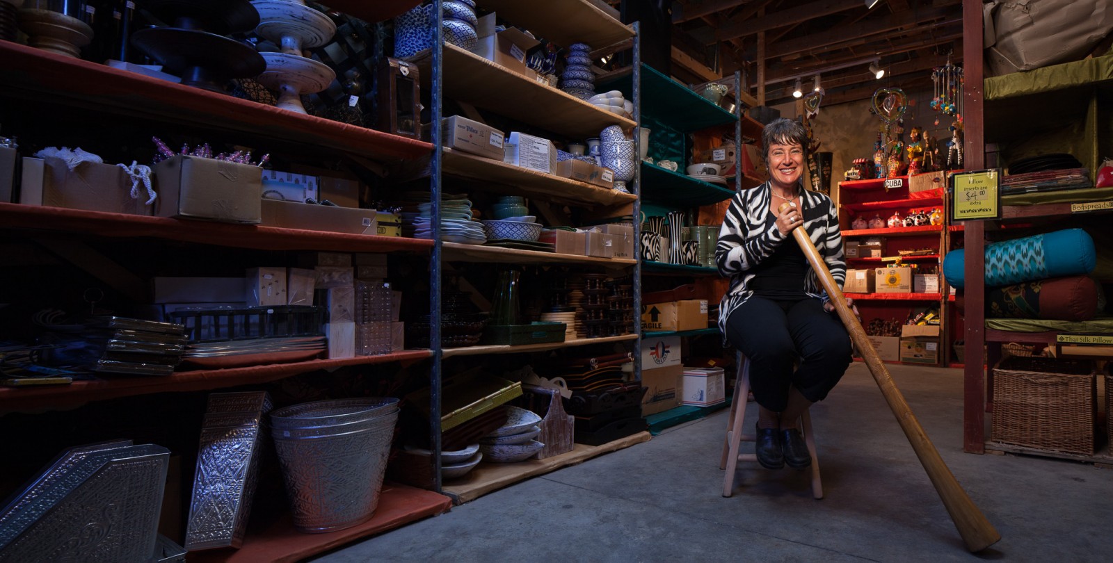
Dave and I went to see Peggy on a particularly rainy day. I hadn’t been to her expansive barn in Manotick before, but I did have an idea in my head of how I wanted a light and airy image taken from a high vantage showing the depth of the location. My dreams, as usual, didn’t actually turn out to be reality, as the space is floor to ceiling stuff and product from dozens or hundreds of different nations. The heavy rainfall axed any chance I had of natural light streaming in from the windows and skylights that did exist, so we’d be working in the dark – again.
I made the decision to shoot this exclusively with speedlights and leave my larger powered strobes in the trunk. Without any particularly large light sources, a smaller, more “spot” nature of the light would suit the space. We spent over an hour tweaking a setup as the staff recieved and stacked crates of foreign carvings. We unscrewed a spotlight that was giving the lens flare, and struggled with booming a softbox and shooting it through a diffuser to create flattering soft, but square, light on Peggy. I used a 50mm f/1.4 lens to blur out all but our subject and meticulously used a panoramic bracket to create a long horizontal shot, but that’s not the image we used, because even taking it I knew it wasn’t as strong as my previous 24mm portraits had been.
Realizing I had spent almost 2 hours producing a piece of crap, I quickly changed gears looking for a less cluttered space, something more intimate. The space I chose had a skyligh above it casting a cool hue down from the cloudy sky. I set up a stool where I saw the lines of the location leading to the subject, we set up a Lastolite Ezybox with a grid on a boom arm, CTS’d it (and a bit more for warmth). I had a speedlight in the back, high, and pointing in at the wall, also CTS’d to fill in the Cuban section of the store with the orange light the spots would normally provide. I then used a small umbrella, also boomed, behind the camera at left with a blue gel and angled down to mimic the colour my eyes saw coming from that skylight. We set up and shot this piece in under 30 minutes, and it was the one that ran.
Sometimes your best ideas aren’t your best at all, sometimes they’re not even good. Often you can figure that out before you even start and it sucks when you carry something all the way through – just because you worked hard on it, doesn’t mean it’s any good. Being able to recognize this and move on quickly is important too. I still had to deliver to my client, and it’s important that *we* are happy with our work whenever possible too. In this case, with a little extra effort and time, we accomplished that.
You can see it bigger on Flickr.
Oct 18, 2012 | Categories: Editorial, Portraits | Tags: Editorial, Environmental Portrait, Magazine, Ottawa, Photography, Portraits | Comments Off on Editorial Photography: Peggy Bakker, Third World Bazaar for BOOM!

Part 4 of 6
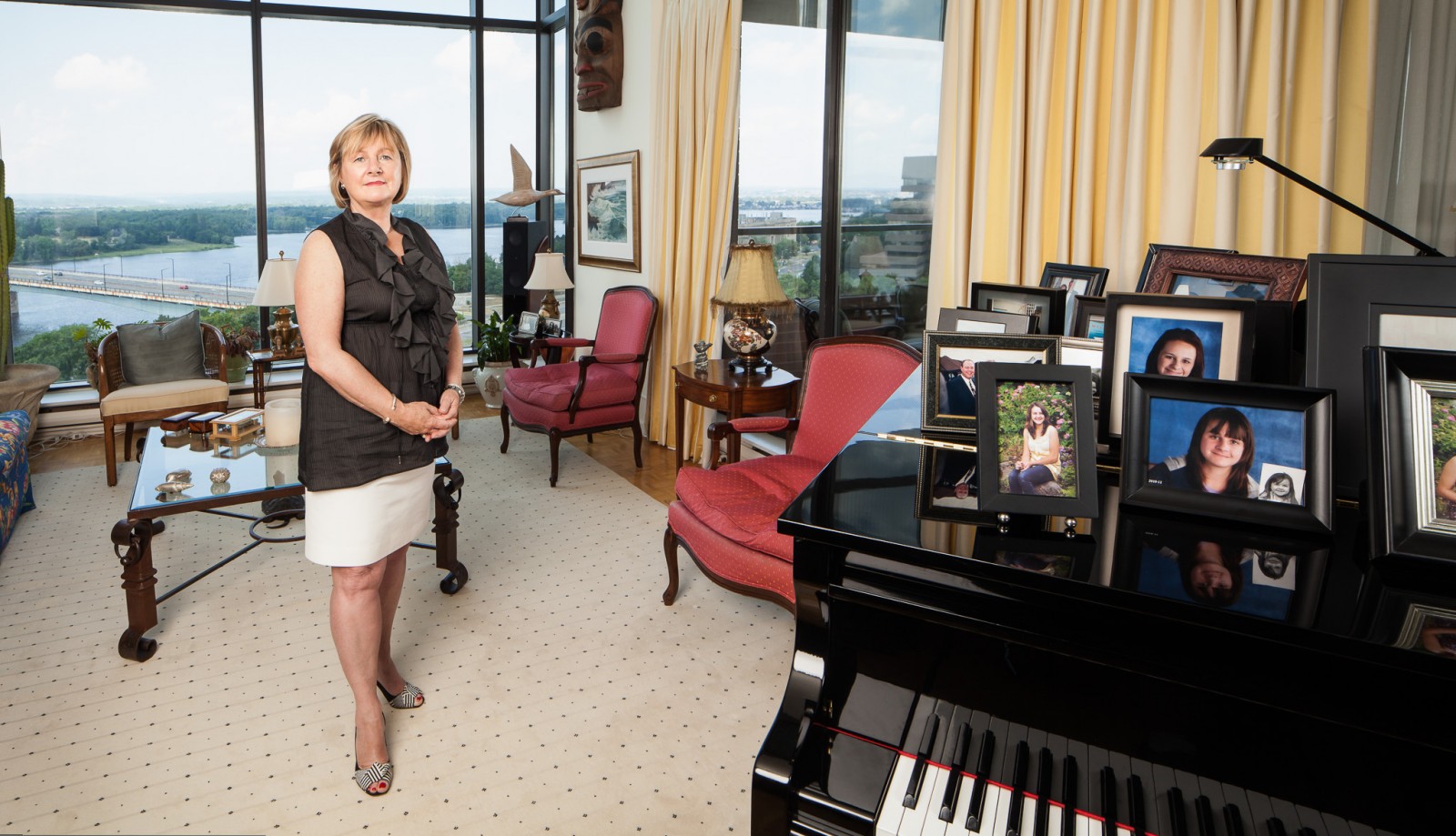
Nancy is a successful Ottawa realtor, but her claim to fame nowadays is chairing “Women for Mental Health” at the Royal Ottawa Foundation for Mental Health. Struck by the closeness of a local teenage suicide in age to her two daughters, she took to fundraising to raise awareness.
Nancy was a little harder to schedule, since she’s still pretty busy with her real-estate work. Originally her people wanted to schedule this at the office, but I knew the article wasn’t about her day-job. Shooting at the Royal Ottawa was also likely off-limits since getting permission to shoot in and around a hospital can be tricky. I was finally able to coordinate a time where she’d be at home which ended up being this incredible condo overlooking the Ottawa river and, in the distance, Gatineau Hills. There werea lot of great spots to take a portrait, but I really wanted to make the connection between her and her daughters. The Piano was already filled with family portraits so that was the clear spot to work.
What you don’t see in the image is the windows extending up another 15 feet – the room was simply swelling with natural light. Of course, i wanted to shoot INTO the light source which meant setting up strobes in a way that complimented the scene. With a giant pane of glass in front of me, I had to try to keep my strobes from casting reflections back towards the camera. We used a 135cm Elincrhom midi octa at camera left as our main with a 1/4CTS gel to warm it. A gridded quadra was outside the patio doors at camera right, no gel, to give her a slight edge light and fill in the left side of her blouse. Finally, we added a gridded 28″ Apollo softbox behind the camera to fill in the family photographs on the Piano.
Our second shoot of the day, thanks to Chris for assisting and eating doughnuts all day in-between shoots. You can see this image larger on Flickr.
Oct 17, 2012 | Categories: Editorial, Portraits | Tags: Editorial, Environmental Portrait, Magazine, Ottawa, Photography, Portraits | Comments Off on Editorial Photography: Nancy O’Dea for Boom!

Part 3 of 6
We worked with Darryl on the last day of shooting for this assignment – the first subject of two in that day. I had to switch up assistants on this gig because Dave went and got himself a real job.
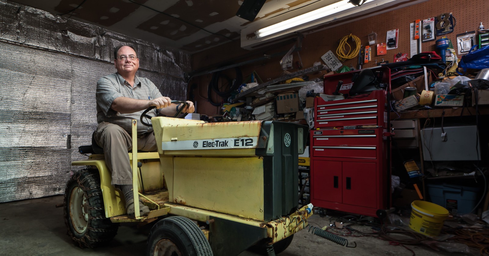
My good friend Chris stepped up for this day which was fairly appropriate as Chris is a bit of a tinkerer and workshop guy, and so was Darryl. Darryl’s been building, equipping and upgrading electric vehicles since 1978. A lot of his time now is saving and restoring pieces with modern battery technology, which I’m sure you can imagine has come a long way.
I took a lot of the lighting concepts I had applied to Paige and tweaked them a bit for this much smaller space. We started by booming a 135cm midi octa up and over the tractor, angled slightly to fill in Darryl face and body. The reflectivity of the… reflectors on the garage door helped fill in some of the shadows, and the large size of the octa provided light for the top of the tractor. This was gel’d 1/2CTG & 1/2CTS to give us that warm green that you’d find in a garage. Continuing to detail the tractor, though, I had to add two zoomed in speedlights – both with 1/2 CTG’s and 1/4CTS (I didn’t need the tractor as warm as Darryl) – one spot filled the rear tractor wheel, and the other skimmed the front of the tractor and a bit down the side. Without these two lights the lower half of the frame was essentially black.
Finally, we added a gridded beauty dish with a 1/2CTG & 1/2CTS (removed in post) off to Darryl’s right (in front of the toolbox) to give him contrast and a 1/2 CTG’d strip light placed sideways to evenly light the “work bench” where the actual fluorescent bulb would have lit, except the exposure didn’t provide for that kind of ambient light. There was a speedlight tucked behind him turned way down just to brighten that corner so he wasn’t completely fading into black too.
It was pretty cool talking to a guy who was into electric powered cars before they were considered the norm, and he’s working hard to preserve some of the short, but very viable, history that currently exists. We were also fortunate to have such an interesting environment to work in. I couldn’t have planned for the reflectors bolted into the garage door if I had tried. Check it out bigger on Flickr.
Oct 16, 2012 | Categories: Editorial, Portraits | Tags: Editorial, Environmental Portrait, Magazine, Ottawa, Photography, Portraits | 1 Comment »

Ottawa Portrait Photographer Justin Van Leeuwen
Part 2 of 6
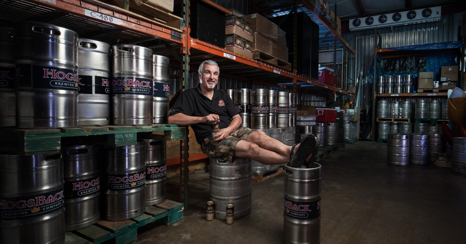
After a few too many drinks one night, Paige Cutland decided to start a brewery: Hogsback. The first subject of my series produced for Ottawa Magazine, we were to meet with Paige at the “Keggerator” which, unlike a home one, holds *all* the kegs for the market. This location was a real blessing, as the day was one of the first real hot ones of the summer. Sitting at a consistent 15 degrees Celsius. Setting up in a large room filled with reflective cylinders, was a little more tricky.
Thankfully time wasn’t an issue, we got in early and didn’t tell Paige to show up for another hour. We had to figure out the shot and how to light it. What lighting there was, was dim and fluorescent, certainly not bright enough to contribute to the ambient exposure of the camera. A blessing in disguise, actually, since there was some mess in the shadows we’d rather not show off.

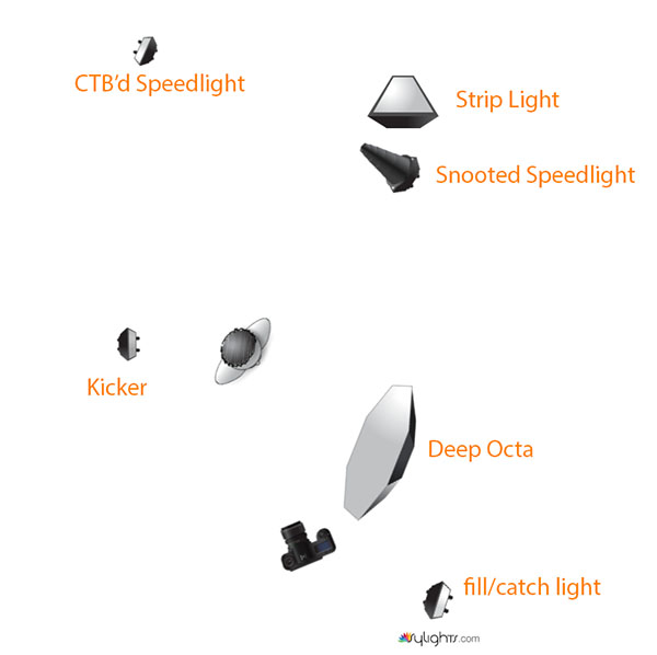
We started by building out the main light for a subject, the dark room called for the punchy contrast the Elinchrom Deep Octa can bring. For my motivated and toned lighting project, I gel’d the main light with a 1/2CTS (Straw) and 1/2CTG (Green). The green would have balanced the light to fluorescent, the straw warms that up. What we get is a warmish green light, that I can move around to add magenta to the scene if I wanted to inject a bit more colour, or just to neutralize it to warm. After doing this, all the other light sources we wanted to be “neutral” had to follow this same gel pattern. Another challenge was giving depth to the room with a limited number of strobes and speedlights. We boomed a strip light high to the back, just out of frame, to give the kegs a long stripped reflection – this defined the back of the room. I had to snoot a speedlight to get a bit more light on some closer kegs, without letting it bleed over and create weird shadows. To light the mid-ground we simply Justin-clamped a speedlight to an empty rack and bounced it off the aluminium siding. It kind of mimics a potential overhead light, though it is a bit bright now that I look at it.
Once page arrived I realized we needed two more lights, a kicker to separate him from the background, which was a simple speedlight zoomed in, and another was an LP160 speedlight at low power, bounced off the aluminium wall behind me to fill in the shadows a bit and, most importantly, adding a bit of sparkle to Paiges eyes. Like all the images in this series, I chose to shoot it at 24mm with a tilt shift lens to create a super-high res panorama for print.
Thanks again to Dave Hassar for the amazing job assisting on this shoot – not a bad first gig together I think. Yes, we did get free samples. Check it bigger on Flickr too.
Oct 15, 2012 | Categories: Editorial, Portraits | Tags: Beer, Editorial, Environmental Portrait, Hogsback, Justin Van Leeuwen, JVLphoto, Magazine, Ottawa, Paige Cutland, Photography, Portraits | 1 Comment »

David Wheelans
Part 1 of 6
This was my first project undertaken for Ottawa Magazine and I really wanted it to show as my best work to date. It would serve to impress my new client (hopefully), and challenge myself to push my work ahead.
I had recently read on David Hobby’s Strobist blog about Gregory Heisler who often, almost always, gels his flashes, since the colour produced by all the artificial lights in our environment is usually anything but the white sunlight to which strobes are balanced.
My challenge was to light my portraits using gels on all of my lights, or as many as would make sense. To mimic the light that would be found in these locations as best I could.
The assignment itself called for landscape-oriented images as that’s how they were going to be laid out. To add to my own challenge, I decided to shoot these all with a 24mm tilt shift lens, and shift it left to right to create a wider panoramic frame. This involved a bit more planning on site, and a one-shot approach to the final image: there would be no alternates for the publisher should I mess up, just the images I presented.
Every day next week I’m going to show an image from the shoot, a lighting diagram, and explain how it was put together. The image today was, in fact, an alternate I did create since we had the time and space to work a bit longer with our subject (this image is not one that went to print).
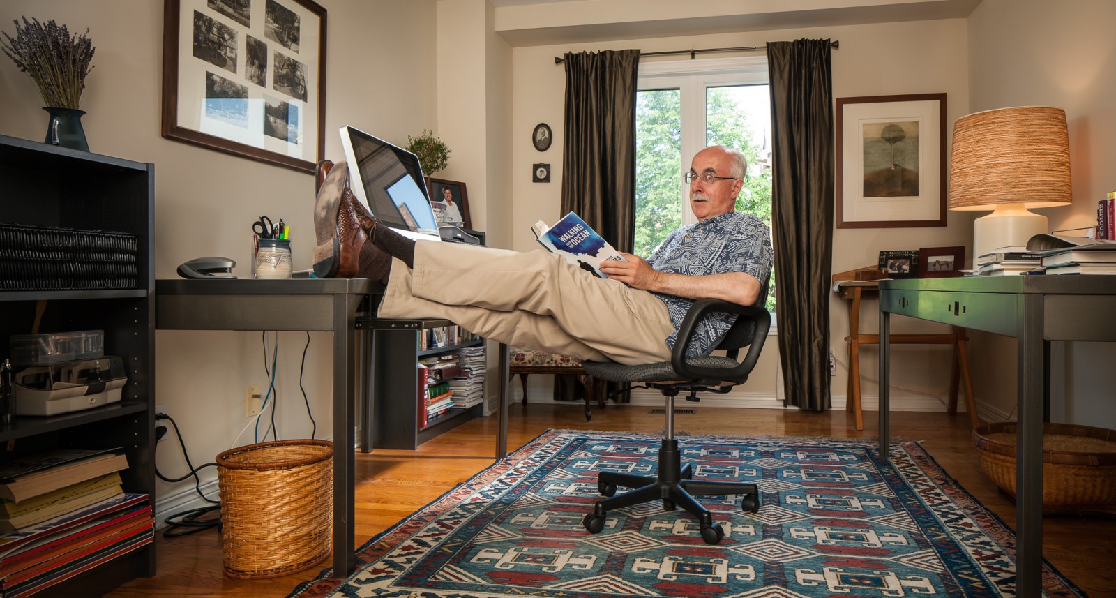
David Whellams is a novelist and he just released his first mystery novel. We set this up in his home studio since a lot of his work happened right here in the office.

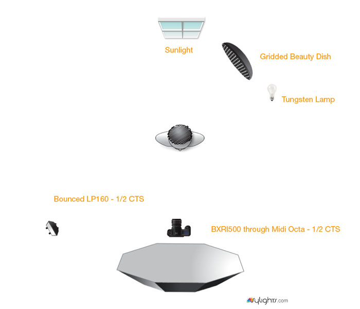
Lighting was fairly simple: a midi octa on-axis with the camera to fill into the room with a warm light you’d find indoors. It was gel’d 1/2 “straw” (orange). Since we were exposing to get a good balance with the back window, we had to mimic the light coming through it that would rim his head and shoulders with a beauty dish. Since it was daylight we didn’t gel that one – and it was removed later in post with a frame taken with the flash removed. Finally, we needed a bit of a light noose on the left hand side of the room, so a small LP160 flash was used to pop into the wall and add some light.
Thanks to Dave Hassar for the assist on this shoot (and third “David” in this blog post), and thanks to David Whellams and his wife for being such gracious hosts!
Tune in Monday for the next image in the series… with beer!
Oct 12, 2012 | Categories: Editorial, Portraits | Tags: Editorial, Environmental Portrait, Magazine, Ottawa, Photography, Portraits | Comments Off on Editorial Photography: David Wheelans for Ottawa Magazine BOOM!

