- Hide menu

Blog

Extreme Family Portrait – Family Games

Ottawa Extreme Family Photography - JVLphoto

Anatomy of a Shoot

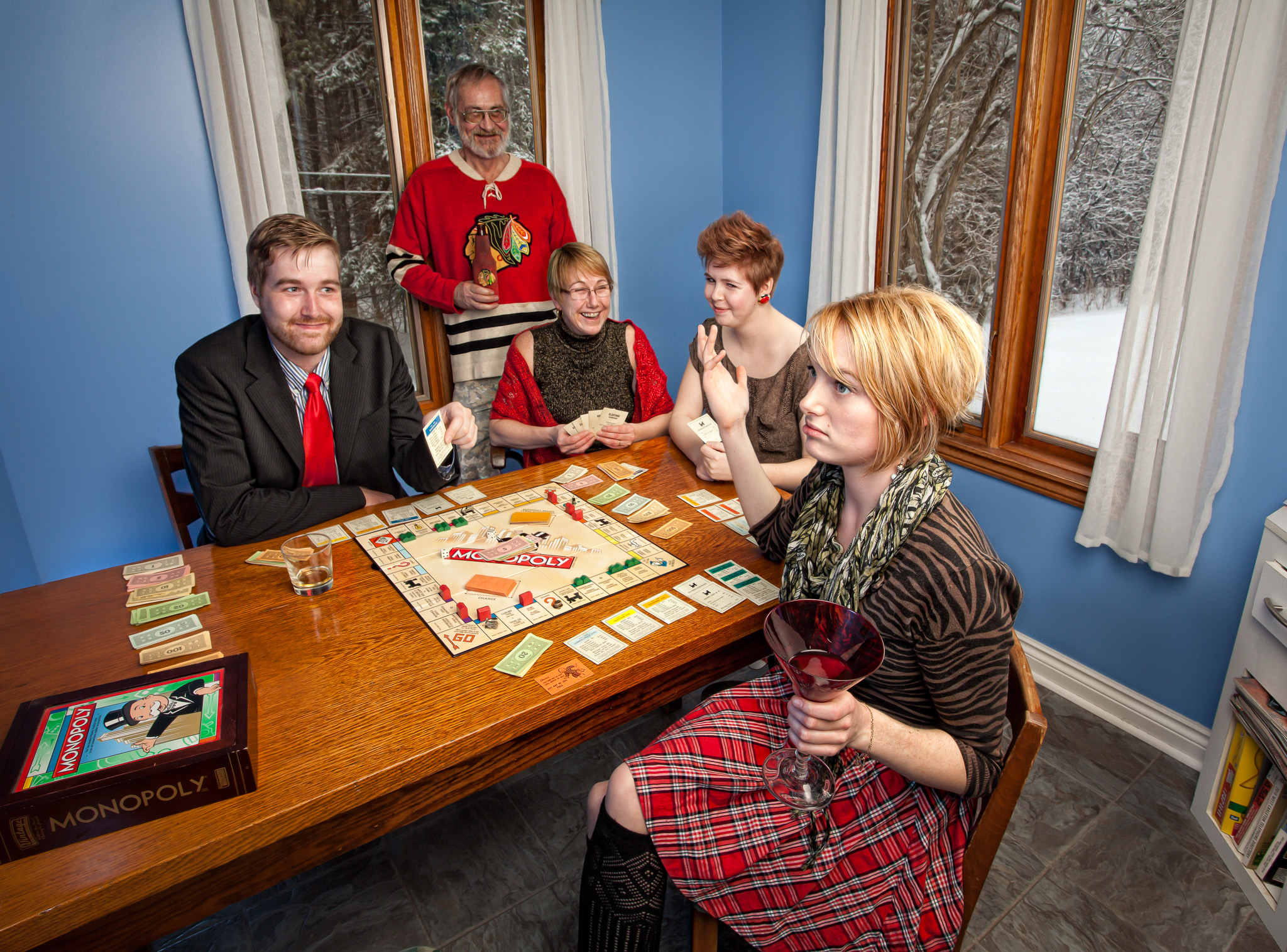
I may not always be able to meet my clients before I go shoot for them, but that doesn’t mean I haven’t gathered a bit of information on who’s going to be there, what their general interests are, and the potential to develop a common theme.

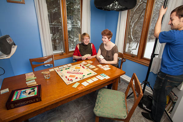
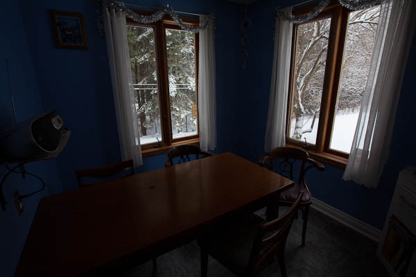
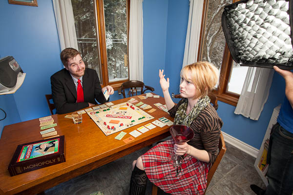
Walking into the above shoot I knew we were going to shoot in the Kitchen nook – I couldn’t resist those vibrant blue walls coupled with the orange texture of the wood. Bonus for being set against an idylic snowy backdrop.

About that – I want to be sure to capture the outside scene, so I set my exposure in-camera based on the outside.

From there I build up my flashes to properly expose the room until I’m ready to shoot the “talent.”

Then we add a few more subjects, taking care to light any areas that should show up separately.

The board game was planned – it’s a family activity – and so is drinking, which I really can’t argue against given my own tastes. A huge benefit to me working this way, especially for my clients, is that they get to choose the photo of them that (individually) looks best. So they can get the best photo of the daughter, and the best of the husband, and the best of the rebellious son… It takes all of the “It’s perfect except she blinked!” out of a shoot. Of course these images take more planning, more time shooting, and much more work after in Photoshop, but I’m certain it’s worth it for my clients.

You can check this image out bigger over on Flickr, and I’ve uploaded a choice gallery of other family portraits I’ve taken over on G+. Special thanks to Lee for the assist, it’s his sexy butt you can see at right in the last photo.

How to photograph your own twitter egg

How to photograph your own twitter egg

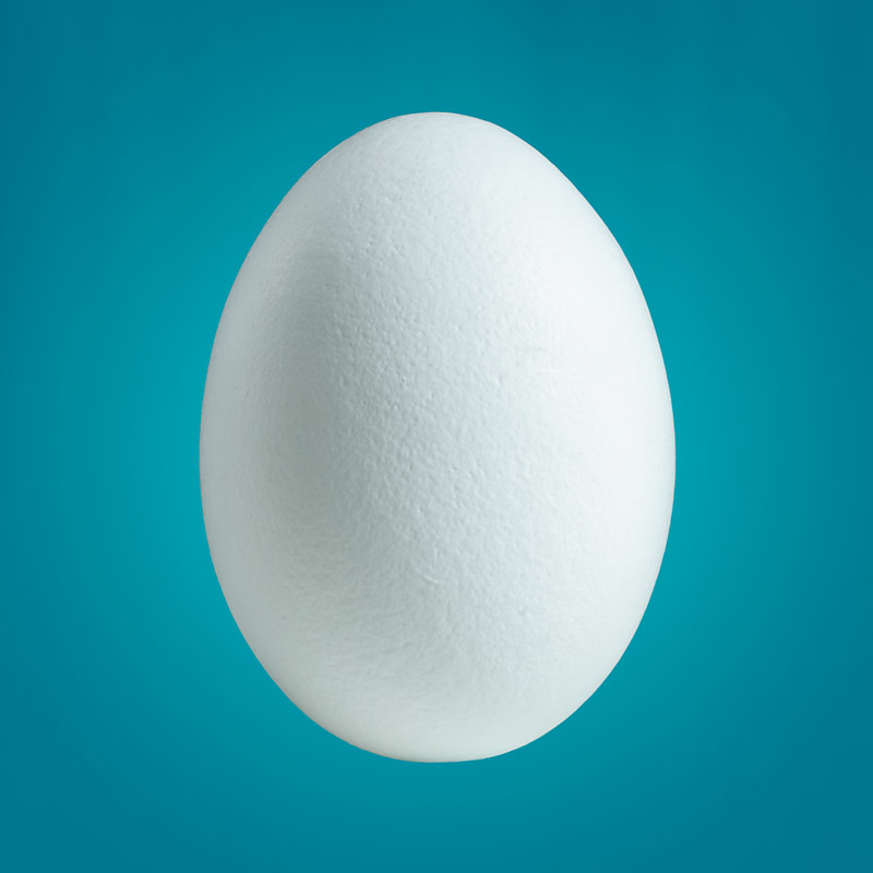
I was on twitter a few days ago, and caught a tweet by someone that asked why a photographer hadn’t shot the twitter egg (the default avatar for new users) as a real egg? And seeing this as an opportunity to actually produce this I said he was right – and I would.

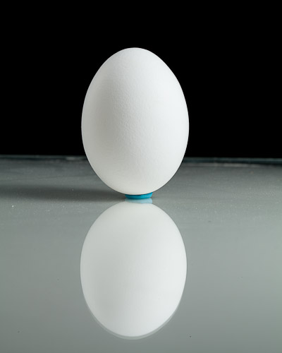
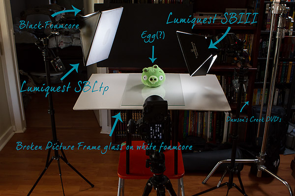
Simple objects sometimes need simple lighting, but it also needs to be carefully applied, too much light,and the egg blows out losing all detail, too little, and it won’t be “white” and the shadow will be dark. I also chose to use two very small, but handy, modifiers, the Lumiquest Softbox Ltp & SBIII which would help control the spill of light and contain it just to my subject. To give the egg dimension and texture I positioned the main light to the right of the egg and slightly in front; so that there would be a transition to shadow. I then added the second light behind, and at a lower power output to give the egg some separation from the black background (which would make it easy to mask out in Photoshop).

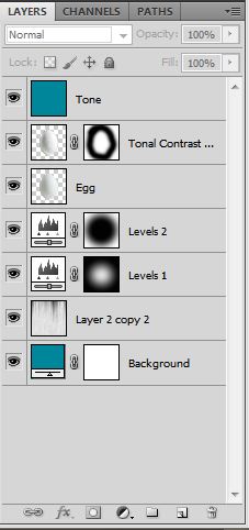
The egg was held up with some poster tack, & I have it on a sheet of glass over white to help bounce light back from below to give it a “floating” look when it cut out. Photoshop was easy enough, Mask, layer, background fill layer, using a sampled colour. The fill layer allows you to easily change the colour later when you want like this. I added some textures to the background,faintly, so it wouldn’t be a flat lifeless colour, I also added a low opacity layer of the background colour over-top of the egg to help the colours seem more natural.

This probably didn’t take more than 30 minutes and it was kind of fun to do. I highly recommend the Lumiquest soft boxes as they fold down completely flat so are super portable – Great for tight head-shots of people too. It would be pretty easy to replicate this setup, and you can choose any colour you want for the background – if you end up trying it out link to it in the comments, I’d love to see your attempt. Setup photo below:

Making the Print – eBook Review

Making the Print - eBook Review

You’d have to pay me to want to get into printing my own work. It’s the same ever-evolving tech as any computer, except now you’re dealing with finite & disposible goods; paper, ink, test paper, test ink, wasted ink, paper jams, paper in the wrong side, nozzle checks, colour calibration, more test prints, a bajillion different papers… Proprietary ink to paper bondings that adhere only with a drop of magical unicorn blood – I’m just not interested in those frustrations. That said, I do LOVE to see my work in print. I tend to leave the “how” to professionals, often with CanvasPop or other local experts.

I think it’s important to see your own work in print, it forces you to make a selection, truly helps you visualize a layout, or a portfolio, or just shows off that image, proudly to everyone you know – otherwise where does it live? A file system in your computer? No – you have to have an end goal for the work.
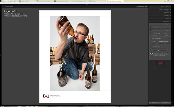
If you’re the kind of masochist control freak who enjoys the torture that a really good at-home printer will produce, then I’m sure Martin Baily’s “Making the Print” is an excellent source for you. Mr. Baily promises at the begining of his Master Class e-book “It’s my intention to help photographers that either don’t yet print—or do but struggle with it to a degree—to not only achieve amazing results when printing, but also to get satisfac­tion from the process of putting pigment (or dye) on paper.”

He takes his time with his readers, since it’s such a nerve racking journey, starting where one should : choice of printers. Laying out the options, and best case scenarios/what to look for. I already feel like I’m shopping with a friend, which is a good thing, because printing is something you don’t want to get into alone.

I will note that, for me, the first 17 pages were a bit *too* N00B, but that’s okay, a lot of people will really have no idea the depths of hell they’re walking into, and they’ll need this step by step to ease the pain which includes simple monitor settings, adjustments in Lightroom, Aperture or Photoshop. And I also want to say that my own experience with my super-simple Epson 835 is that, despite my best efforts, the Printer’s own management actually does make the best choices when printing. Go figure.
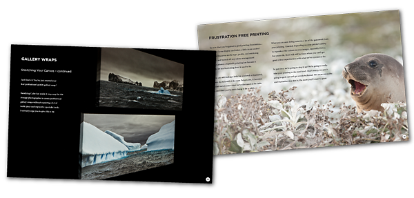
Part 2: Step it Up

This is where all the meat of the book is, the stuff that’ll get you making great prints. Taking you cleanly through proper monitor calibration – which insn’t particularly difficult but does require the purchase of a calibrator – to soft proofing in Photoshop, and using fine-art papers. The later being, admitedly, the only reason I’d even want to bugger myself with a home-print job.

Mr. Baily has a fascinating step-by step on creating gallery images, including the lamination of your prints, and stretching your own canvas. As I’ve mentioned, this is the sort of thing I personally prefer to send out to the pros – leaving me to worry about taking more pictures.

While Making the Print is an excellent guide to get anyone who’s interested in doing this work yourself started, I have far too little patience for the tedium involved in “getting it right” and would be just as quick to enact the scene from Office Space as you may be to buy a large format printer. If you’re at all interested in making your own work and getting it to gallery – then this is definitely the book to get you there.

You can buy “Making the Print” now at Craft & Vision, and until January 21st use the code “Print4” to get the PDF for only $4! OR use the code PRINT20 to get 20% off when you buy 5+ PDF eBooks from the Craft & Vision collection.
Money you’ll need to save since you’ll be blowing the rest on test paper & ink 😉
Friday Wanderings – BYBO & Macgasm

Friday Wanderings - BYBO & Macgasm

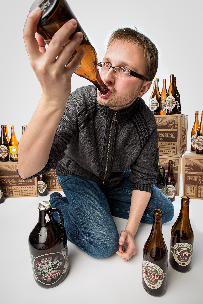
I’m not here today, not really, apparently I’ve had a few beers and you can find me writing about them on LTOttawa, drinking them while playing games on Macgasm or writing off-the-cuff remarks after having a few on G+.

Enjoy – and happy weekend!

The Adopted

The Adopted

Off to a late start on the blog am I? Whatever. I’ve been busy.

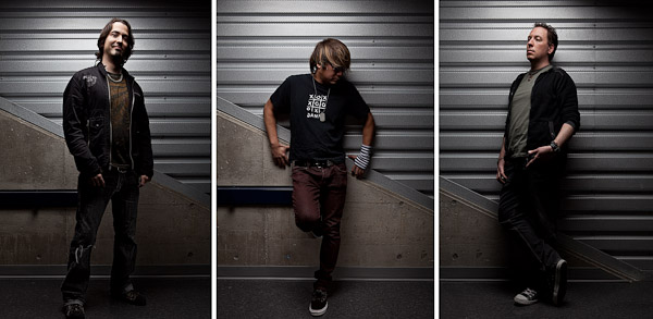
My very first gig, when I moved to Ottawa, was with the front-man for a band called The Adopted. We’ve gotten together a few times a year to hash out some ideas and do some band shots, which has seen us go from a skate park to the top of a roof.

This year I wanted to focus on a simpler setup. There have been a few changes to memebers of the band so I wanted to simply the shoot, keep it from being action-oriented and throwing the members into memorable scenes; I needed them to be memorable.

Admittedly, this was not the first attempt at this shoot, we had a different location we had worked at, but it was -11 or something and every frame came out predictable: they looked cold. We were able to work at Algonquin College over the Christmas break so the place was practically empty.

The lead photo here, I can only take a little credit for. I had Lee & Younes assisting me during the shoot and while they were slacking off scouting, they came up with a low shot using the grow-lights (for a 4 story living wall) as a sort of rock-star backdrop. While it seemed pretty bright, I still had to boost the ISO to get the combination of aperture (I wanted star-bursts on the lights) and shutter speed so they’d be sharp. We also dropped in a few speedlights behind them for rim – you can see the lighting info over on Flickr.

You can check out the Adopted over on their MySpace page.