- Hide menu

Blog

CanvasPop Facebook shoot

CanvasPop Facebook shoot

You can catch even more me over at CanvasPop’s blog this week talking about protecting your images online (if you choose) don’t miss it!

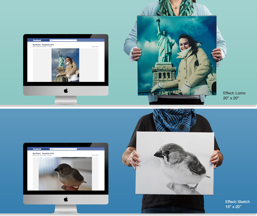
My friends at CanvasPop called me up a few months ago to take the product photographs for their upcoming Facebook print launch. They had tapped the Facebook API so that users can upload their low res Facebook images, apply a filter, and end up with a really nice wall-hanging piece of art.

The job called for a studio shoot, clean background with the potential to change the colours or even composite the subjects later. The client wanted it on-location too, which works for me considering my standard cramped quarters. We also had a photographic stylist on-hand, Catalina Bloch was an incredible asset, she brought accessories, did mild makeup, and helped refine poses of the subjects, which allowed me to focus on the final look of the image and some of the technical setup. The more we can compartmentalize a shoot, break up sections so that peoples expertise can really shine – the better the end product for our clients.

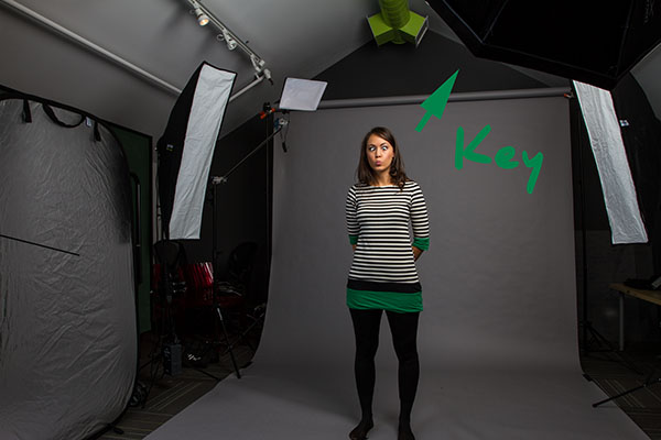
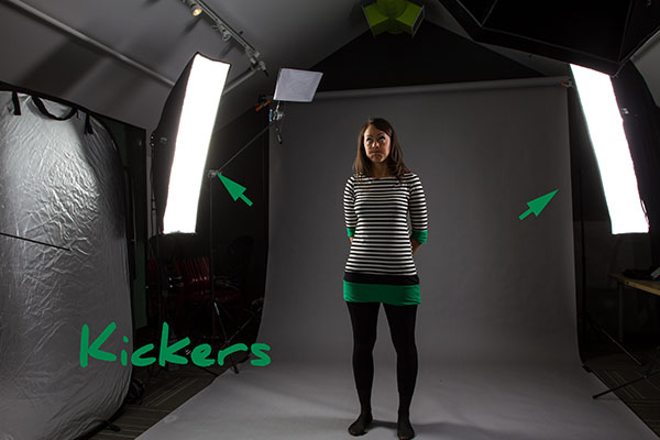
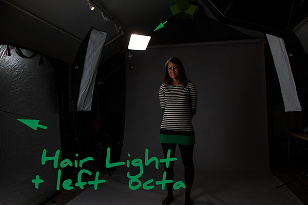
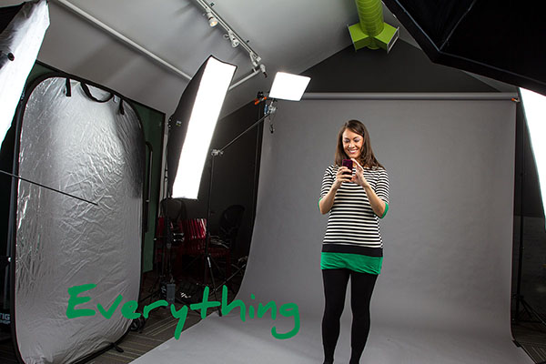
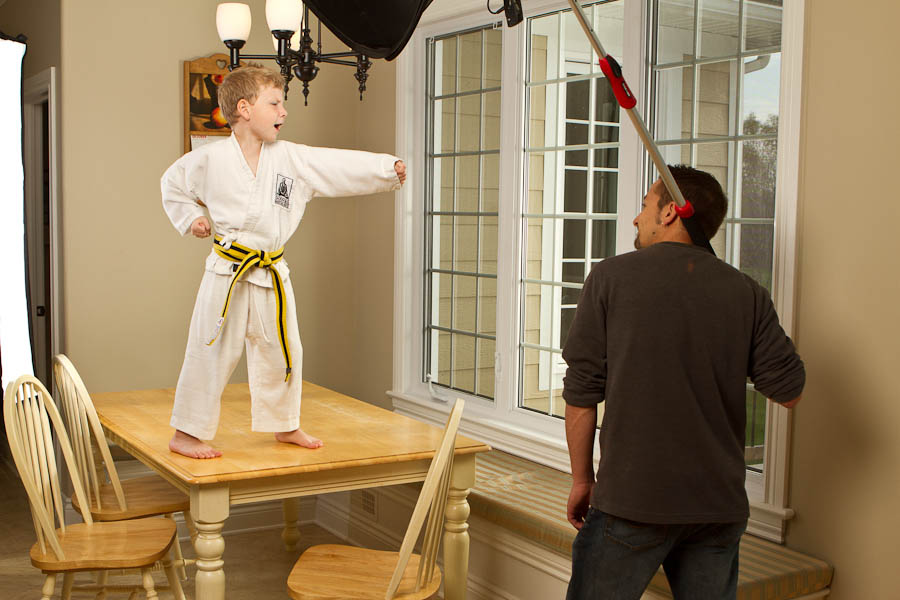
We shot on a large dark grey seamless, which gave a neutral colour that could easily be swapped in post. I then had a 6 light setup two strip lights, a hair light (using a lumiquest Softbox ltp), one large Octa at camera right as a key, and another at camera left for fill coupled with a 6 foot silver reflector. This combination provided a broad swath of light, but not one without shadows – just with controlled shadows. Below are some setup shots as we established our lighting ratios:


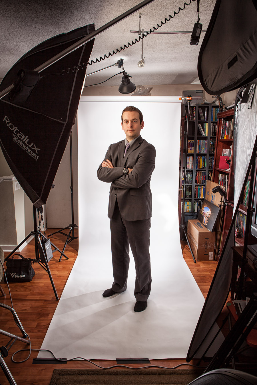
Of course we couldn’t resist taking a self-portrait at the end of a very long day. Thanks to everyone at CanvasPop for letting us take over their offices, and thanks to Catalina for another amazing styled shoot.

Mediastyle Redux – HoneyGrid, Beauty Dish & Ringflash

Mediastyle Redux - HoneyGrid, Beauty Dish & Ringflash

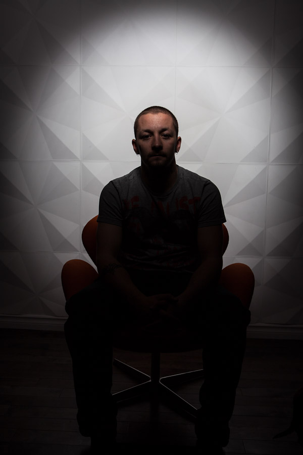
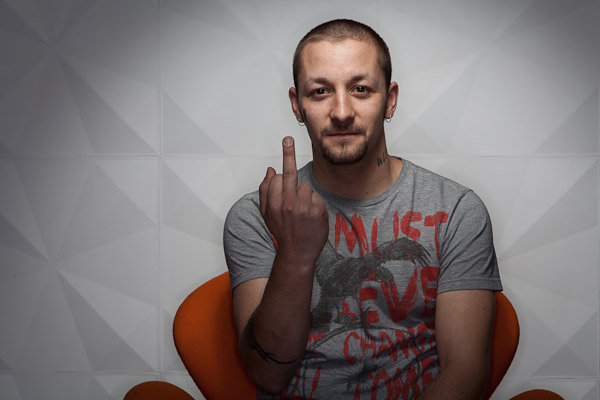
Part of the Mediastyle shoot was this small wall that, literally, popped out in areas, I couldn’t resist hitting it with some light and using it as a backdrop. I knew it needed to be simple, but effective, and I’d been itching to use the HoneyGrid for my Elinchrom Softlight (Beauty Dish).

For those that don’t know; grids channel your light into a much narrower beam to give you control over the edges and spill of that light. Normally a beauty dish has a bit of spread (the fade from light to dark) once the light hits the end of the bowl, but slapping the grid on there beams the light directly at your subject. So much so, actually, that if you don’t position it right you’ll miss your mark.

To my knowledge, honeycombgrids.com is the only game in town for these beauty dish grids – no, Elinchrom does not make them, and if they did I can assume they’d be twice as much – and the retail price is reasonable considering the cost of most photo supplies. The construction is good, a light piece of welded metal encircling a plastic honeycomb pattern grid, you can see how and what they make it out of here. The unit comes with Velcro that you stick one end onto your beauty dish and bang, you’re ready to go.

While I think light control is important, and there’s certainly value in the purchase itself, there was one snag that made me hold off on the purchase for a while: Shipping. How shipping cross-border from the U.S. to Canada is determined I’m not exactly privy to, or how a light, flat and round grid can cost more than a few light stands from B&H can only be explained through complex algorithms that may be rounding pi to a different integer. Shipping was $10 less than the cost of the item itself.

Ouch.

Sometimes us Canadians get shafted.


Thanks Lee for your hard work on this shoot. If you want to see the full lighting specs on the above image you can see it over on Flickr.

MediaStyle Portraits

MediaStyle Portraits

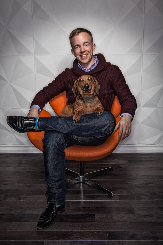
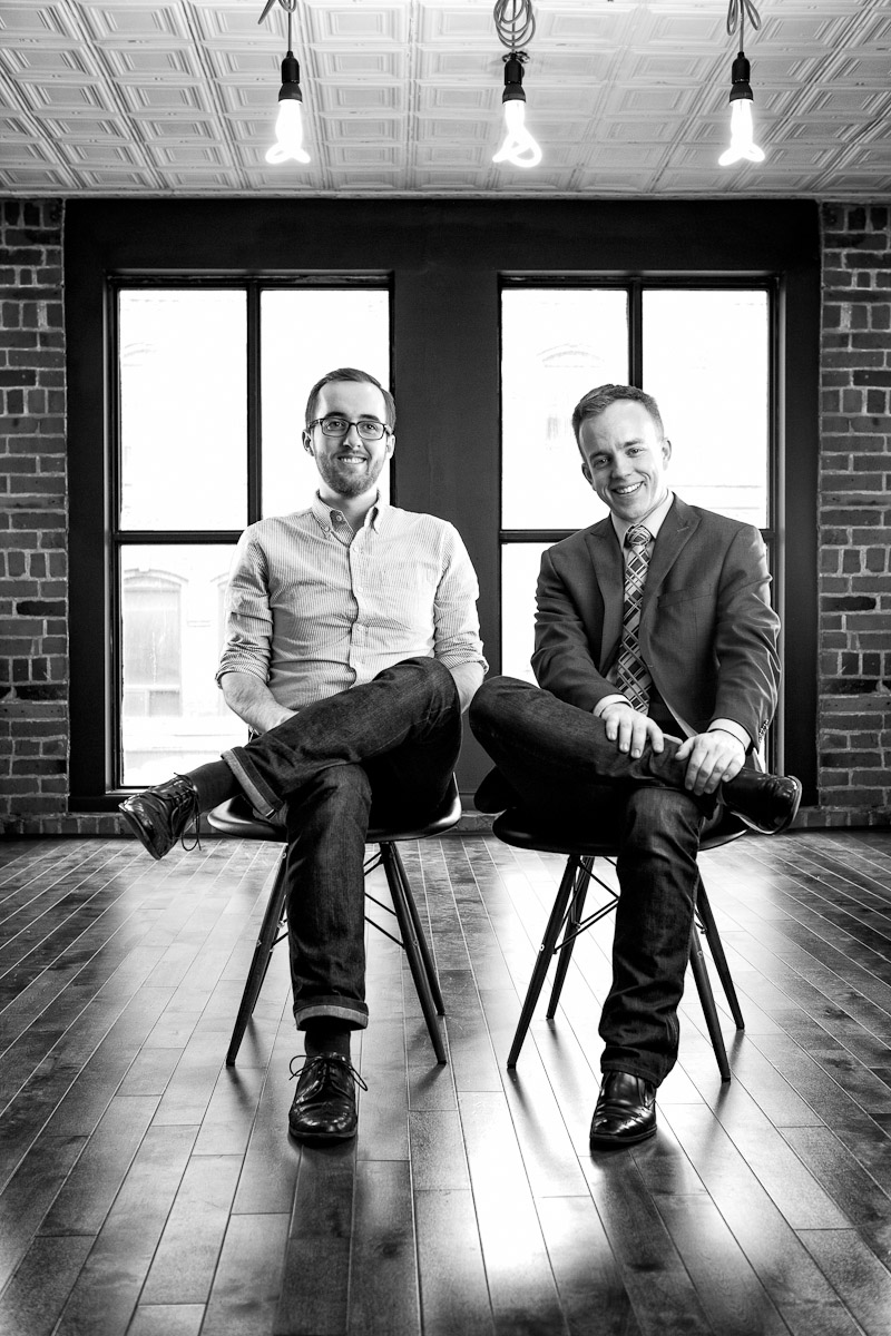
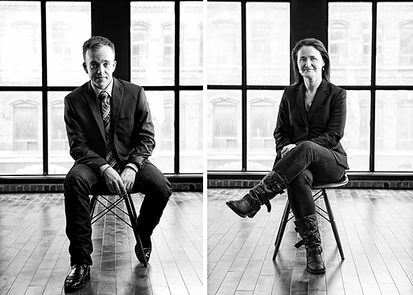
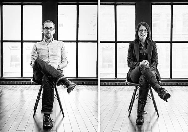
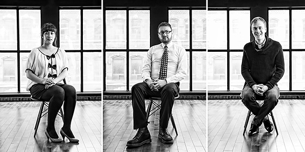
I was recently commissioned to provide an Ottawa-based media consulting firm with headshots for their staff. I had worked with Mediastyle before, and I was pleasantly surprised when they offered me no direction on how they wanted their portraits to look. IE: I had complete control. A dream!

Of course there were still limitations,it was all in one day, so Lee and I had to get in and figure out several setups on the spot (though I had scouting images from before in preparation so we had a good idea of how it was going to go down). I was also shooting interiors for their new office (a pano you can see over on Flickr), and a good interior shoot will take me 2-4 hours depending on the space.

An Interior shoot, two portrait styles, for ~7 people, and a few wardrobe changes. It was a great day though, and I think everyone there really rocked their shots.

If you want to see them individually, bigger, I have them up on Flickr too With lighting setup info (if that sort of thing interests you).

Family Dynamics

Family Dynamics

I photographed this family a few months back, but we kept going back and forth on which image we’d use as final (my clients get selects of how they look so they can pick and choose the image that individually works best for them) – that’s the great thing about shooting a composite – we can always swap one “bad” photo out for one you like better.

I won’t bore you with the lighting details, I’ve gone through that kind of stuff before, but if you’re interested I have it all up on Flickr. What I will mention is how important walking in with a plan was. We didn’t book the date of the shoot until we had a solid concept of *what* we were shooting.

But wasn’t I just shooting the family? Sure, but we needed an interaction with them that (however loosely) made sense to them and displayed everyone’s character properly – that’s what these extreme family portraits are all about after-all: they’re about showing your family as it really is.

Again thanks go out to Lee, again, for being a reliable VAL and booming that light. BOOM BABY BOOM!

Professional Headshots in a tight space

Professional Headshots in a tight space

A little known fact: I also do “professional” headshots too. Now I don’t do a lot of super-dry coiffed hair & skin smoothed until you’re a barbie doll kind of stuff, I like to give all my portraits a vibe of reality that communicates my subjects; I want their character to come out. And yes, some of that character are the lines on our face, and some of your hair sticking out at the side – it’s who we are – and I think a real personality will draw a viewer into an image much faster than a “perfect” photo will any day.

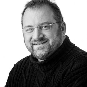
Often I go out on location and photograph my subjects in an environment they feel represents them and what they do. That’s not always an option, of course, and it is a bit more spendy to drag me out of my studio [Read: home]. So every so often, I set up a white seamless at my studio [home] and call up some of the people who wanted or needed shots but we hadn’t worked out a budget, location etc. Book them back to back and you have yourself a good day of doing business with some great people.

The Setup

I don’t have a lot of space, not a lot of people do, and if you really want to work well with a seamless backdrop space & distance is probably what you want the most of… but failing that we can work simply to accomodate the needs of your clients while creating a clean professional look.

I have a 4′ seamless white, which may not be great for full-body portraits, but is ideal for headshots & busts in a tight environment. I still try to maintain as much distance between my subject & the backdrop as possible, probably a few feet in this case (ideally it’d be, like, ten). I then add a few speedlights, close and bare, to whiten the backdrop. I have to dial in my power on them to make sure it’s on the verge of blowing out, but not so much power that they reflect light BACK into my lens creating flare and softening my image. In this case I also added a 18″ dish & elinchrom Quadra high above my subjects pointing directly behind them to create a hot-spot on the white behind their heads, if some of this light bounces back I’m cool with it as it’ll create a bit of rim on their hair, head and shoulders.

I had tried complicated 3 light setups in a tight space before, and I found them pretty foolish. All that grip gear and modifiers in tight on your subject can get kind of intimidating, and if they’re clausterphobic well, good luck. You’ll also find that if everything’s so close together, a lot of light will bleed and bounce from one spot to the next. So I’m likely to get light bouncing from my ceiling and walls too – so an absolute controlled light likely won’t happen – but I can plan for this with a solid single key-light approach.

I get my Elinchrom midi-octa at camera left and pull it in tight to my subjects, it’s got a deflector on the inside and two layers of diffusion material, so something this big, this close, will create a brilliantly soft light. I also put a large reflector at camera right to ease up the shadow on the far side of the subject. I’m not worrying about spilling my light at this point, because I’m shooting with it in mind – I’m using the bounce to turn my one key light into a key & fill.
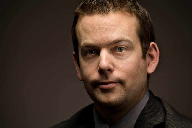
If you have the time, you can also boom in another modified light setup for a different look which may (or may not) turn out, but it gives your client options in a constrained environment.

The rest is easy, it’s all about the photographers interaction with their subjects and, hopefully, we come away with something they like. Since this set up is universally applicable, I try to book a few sessions for the same day to make the time I put into it worthwhile.