- Hide menu

Blog

Monkey House

Monkey House
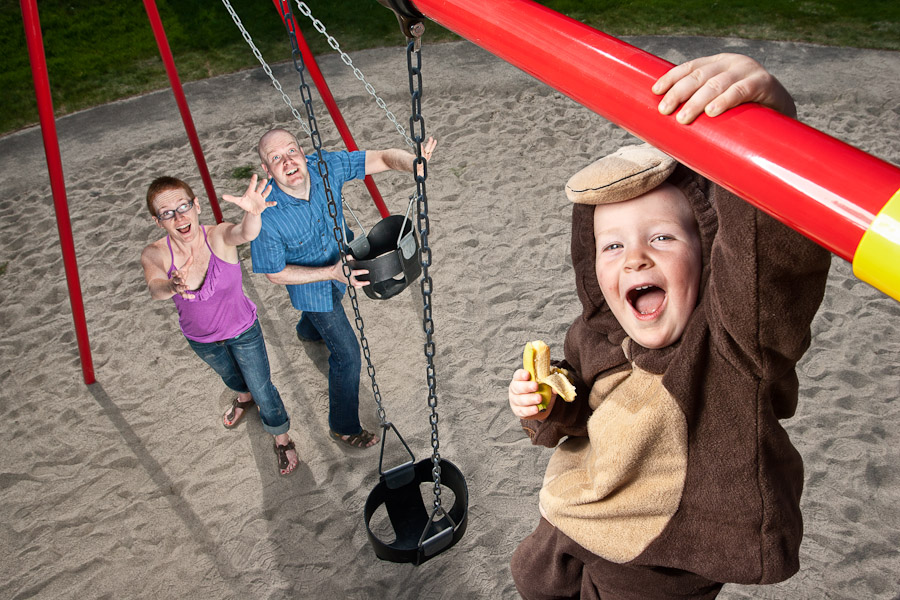
The monkey house has been of great support to this blog over the past few years, helping me customize the layout of my website and a lot of behind the scenes tinkering. I am grateful for the work, and it was only appropriate that, someday, they’d have a more extreme portrait taken for me to show my thanks.

The vision for the monkey – that’s what they call him – came naturally, obviously. Which doesn’t always happen. Sometimes I need to work on creative for hours, days or weeks beforehand; getting ideas from the subjects on their personalities, ways I can show their character and bring it out. It’s one thing to take an image that captures a moment, a unique skillet itself, but to pre-envision a shot, especially a technical one, takes some work and doesn’t always come as easily as this one did.

The work is, largely, Vision. Big “V” – the idea – how to present it, and being able to make compromise when the time actually comes. I want the readers of this blog to help their own vision along, maybe find some inspiration in the words of others (I know you’re not getting a lot of that from me obviously *wink*). So I’m going to give to you what has recently been given to me: a gift.

I’m a fan of the inspirational readings of Craft & Vision, their ebooks (at $5 each) provide a value rarely seen in the photography industry. If you don’t like reading, the imagery contained is worth the admission.
But I’m going to let you cheap right out, I’m giving away a $20 gift certificate to Craft & Vision. All you have to do is leave a comment; tell us about a vision you turned into an image, something you created all on your own share a link, or even tell us about something you WANT to do, but haven’t done yet.

Leave a comment and I’ll select a winner, at random, Friday June 10th at 12 noon (EST). I’m looking forward to the tales!

Update! Congratulations to Marcus Taylor who shared his vision of a long-exposure waterfall while taking a lovely portrait of his wife. You can see his image here.

You can see this photo bigger over on Flickr, as well as the setup for the monkey here.

Spacing National

Spacing National
I’ve been a contributor to the Spacing Ottawa blog since it was launched a few years ago, I’ve had a great working relationship and friendship with it’s editor Evan Thornton too. He has been my proponant and a fan, which always makes it easier when working on assignment for them. I’ve even been fortunate to have a few images from around Ottawa in their print magazine for the small articles published from Ottawa.

As a Torontonian, living in exile, I’ve also admired the work of T.O.’s prominent photobloggers like Miles Story and Sam Javanrouh, these guys were pumping out daily photoblogs when I got my first SLR. A great case of networking now has me working along side them, indeed, colaboratively as one of Spacing Magazine’s first national issue covers (image at the top of this post) is a colaboration between Sam and myself.

Sam has worked on these tiny planets quite a bit before, and that’s what gave the publishers at Spacing the idea to have an Ottawa tiny planet, of Parliament (what else?). It was no problem for me to get the photos, though I hadn’t done a tiny planet before I got the “basic” idea that it was a 360 degree spherical panorama, but I was lacking the software to do the work, and the experience in editing all the irregularities that this kind of photo merge would bring. Thankfully, for, me, Sam worked his ass off to process the image and you get the sunrise on Parliament that you see above. The biggest trick for me was waiting for the RCMP car to move off the lawn early in the morning.

You can see the other national covers (one for each “region”) on Spacing’s flickr set here. If you’re in Toronto, there’s a launch party tomorrow at the Design Exchange and then they’re hitting the road, I’m more than likely to attend the event at the NAC next month. You should be able to pick up your copy at one of these fine retailers, or now, at any Chapters/Indigo in the country.

I’ve been extremely fortunate these past 6 months as I put myself towards photography full time, I’m gratefull for my clients, my frends, and all the other photographers I’ve had the opportunity to work with and meet. Thank you Matt & Evan at Spacing, and Sam for working so damn hard on this image.

Welcome visitors from DDOI, if you made it all the way down to the bottom of my ramblings, have a look around the blog, you can navigate using the left & right arrows on your keyboard! You can also view this image on Flickr.

Feedback

Feedback
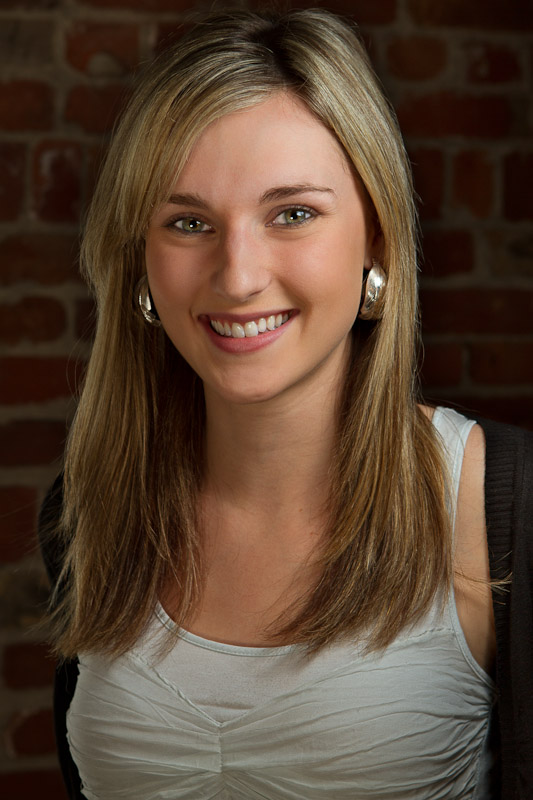
Earlier today I tweeted that I had nearly 200 views on the above photo of Lisa Barker on Flickr but ZERO comments. That means 200 people looked at it, said “meh” and went on there way. A fair appraisal, I guess, it’s not a perfect portrait (no fault of Lisa’s) but I felt it sufficient to display to the world, hoping to get a few hits on some trouble spots I knew existed, but maybe I could sneak past a passive audience.

Boy was I right! Passive indeed, Flickr is a giant photography circle jerk, with lots of nice images, nice comments, nice feedback, and not a lot else. Everyone is so afraid to offer, or even accept (I’ve been reamed out for offering unsolicited advice, to which I’ve admitted, being in the wrong) criticism that it’s devolving beyond the cordial “nice shot” to absolutely nothing. It gets worse if you’re featured in Flickr’s own “Explore.” Explore should be a showcase of the best, the most striking 500 images of the day, and sometimes it is, but what REALLY happens is it opens your image up to comment spam. Just read a few under this photo of Claudia from the last blog post, which came in, initially, at #38 on that day’s Explore. Do you see those comments? It’s hard to separate the people from the bots. It’s frustrating and I’d love to just flag half of these “people” as spam – because they’re taking away from the other half that deserve a huge hug – If they were comments on my blog I certainly would have.

My frustration comes from a belief that it COULD be better, I think everyone uploading images to Flickr, publicly, are trying to get them seen, show them off maybe, but get seen, and as the viewer, this is an opportunity to interact. Say something nice, say something bad, say something constructive – you’re given a voice so say something! If you’re being honest and just offering up your opinion, you’d be helping any artist realize the subjective nature of the field and they can weigh their options from there. I will point out that anyone saying they’re open to comments, but shooting down anything remotely critical is likely a liar: you can turn comments off if you don’t want to hear anyone (and this is a valid option).

As for the above image? This is the edit, as a result of the feedback I did receive thanks to the lovely Nicole Young and her shilling my whining to her considerable twitter audience. I brought up details on the dark, black cardigan, the background, while toning down the brightness in her hair, slightly softened her skin (I’m not a fan of overdoing this) and a bit more light to her eyes. But, one comment was to get more light on her face and, personally, sorry, no. I like the shadow, the contrast of light was intentional even though cutting her back arm at the back wasn’t…
so there, I’m leaving it, and what do you think?

Swing Dynamite

Swing Dynamite
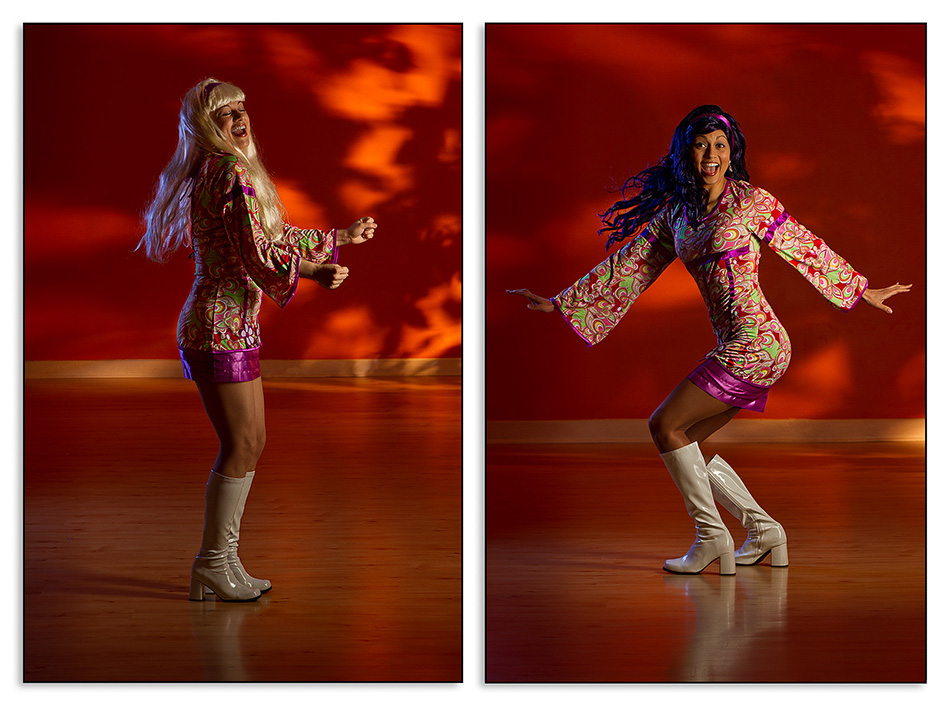
Claudia Petrelli is a Colombian ex-pat who runs a swing-dance studio with her daughter, “Swing Dynamite“. We had known each other via twitter for some time, but never really got together until one of the more social drinking nights in my neighborhood.

She had mentioned how much she liked the photos I had done with my kids, and a few other families, and asked if we could do something like that for her and her daughter. Of course jumped at the opportunity to work with these two beautiful and talented swingers [see what I did there?].

Their studio was so spacious, it was a dream to work in, given I’m usually confined to small and cluttered family and kids rooms. Space allows for distance, distance allows for longer focal lengths, which in turn minimize the distortion inherent in wider lenses and allows for a more flattering image of the subject.

On that day I had forgotten (I admit it!) a critical adapter that connects the Elinchrom Ranger Quadra to the strip light I picked up off eBay (under $100!), thankfully, I had Amanda there that day to save my butt and act as the lightstand and bracket to hold the light in place (seen below). I could not have done this without her and am thankful I work with other very talented photographers. If you get a chance, you should definitely run over to her blog and check out Amanda’s work.

Since Claudia and Natalia are performers, they already had a few costume ideas for our shoot, the only thing I had to do was light it and the scene. To add some visual interest to the background, I took a flsh and blasted it at a fake tree off to camera right and way back in the room. The strobe was CTO’d to make the already orange wall really pop.

We did a few setups and scenarios, but these were my personal favorites of the two. You can see them larger, with more info on the lighting, over on Flickr here and here. Let me know what you think!

Working for free, for pay.

Working for free, for pay.
Working for “free” gets a bad rap, of course it’s also often misinterpreted in what free involves.

A few months ago I was contacted by the lovely folks over at Local Tourist Ottawa to write a blog post that included a good selection of my personal work from the Ottawa area. Now, I do believe that writing is a commodity and has value, as do my photographs, and I do charge for their use on websites. This time, I decided I was very much okay with the terms of this relationship as I like the blog, found it a good fit, and was given freedom as to what I would write and include photographically.

This was a mutal exchange – they gave me creative freedom, and I gave up my rates because I was happy to do it. No fuss, got some exposure, showed my work, all for a few words and photos I had already taken.

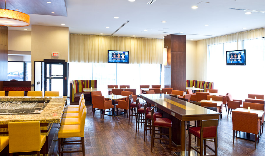
A month later the article was retweeted by the Ottawa Marriott twitter account – in short – praising the photographs. Hmmn, well I think that since I am trying to build my client list for real estate & architectural photographs, perhaps they’d like me to come and photograph their hotel? But what’s my “in?” They’re a big hotel chain and I’m new kid on the block who doesn’t know anybody. Free?

So I made them an offer. Let me come in, take “my” photos, if you like my work then you could use them online (just as I would do) and if you (the Marriott) would like do anything else – ie: commercial use/print advertising etc – then I would license them to you. This is a great option for them: No cost up front, no risk. The worst thing that could happen is that I have spent a few hours with access to a newly renovated hotel to add images to my portfolio.

I’m happy to say that I got those and more! The fine folks at Ottawa Marriott were happy to license many of my images for promotion, and I was successfully able to turn “free” into work – good paid work. Some will criticise me for “stealing” another photographers work, I think I’ll address that too. The Hotel already had images taken, very professionally, but much of their main lobby was under renovation at the time so my work was to merely complement those already taken. In no way am I trying to supersede their work, under-quote them or steal their client – if I’m asked to do work again I will quote my day rate – that’s just business. And really, ultimately, it’s not up to ME if I work again, or if someone else does, of course I contribute to it largely, but saying one photographer has stolen another’s work doesn’t give the client a lot of credit. They make up their own minds, make their own decisions, and build their own relationships. It happens. It’s my job, now, to properly steward all my clients, to keep and maintain those relationships.

Not every situation will work out this way…but if you are not booking jobs, your full time job is to MAKE jobs happen, all the while expanding on your personal portfolio. An element that certainly helped me succeed in this instance was treating the free shoot like ANY of my paid shoots – including the the same follow-ups, communications with the client, and a contract stating what will and won’t happen with the images. Service. And that said, I am happy to add the Ottawa Marriott to my client list. Hopefully other entrepreneurial photographers, artists, or creatives will see that this model DOES work. But it involves doing your best work and having some foresight into where it can lead long term.

Do you have any strong feelings about this? Either way? Have you ever did a job for free – did it pay off in the long run? or were you left dissuaded? I’ve done it all – sound off in the comments!