- Hide menu

Blog

Hintonburg Photographer – Elmdale House Tavern

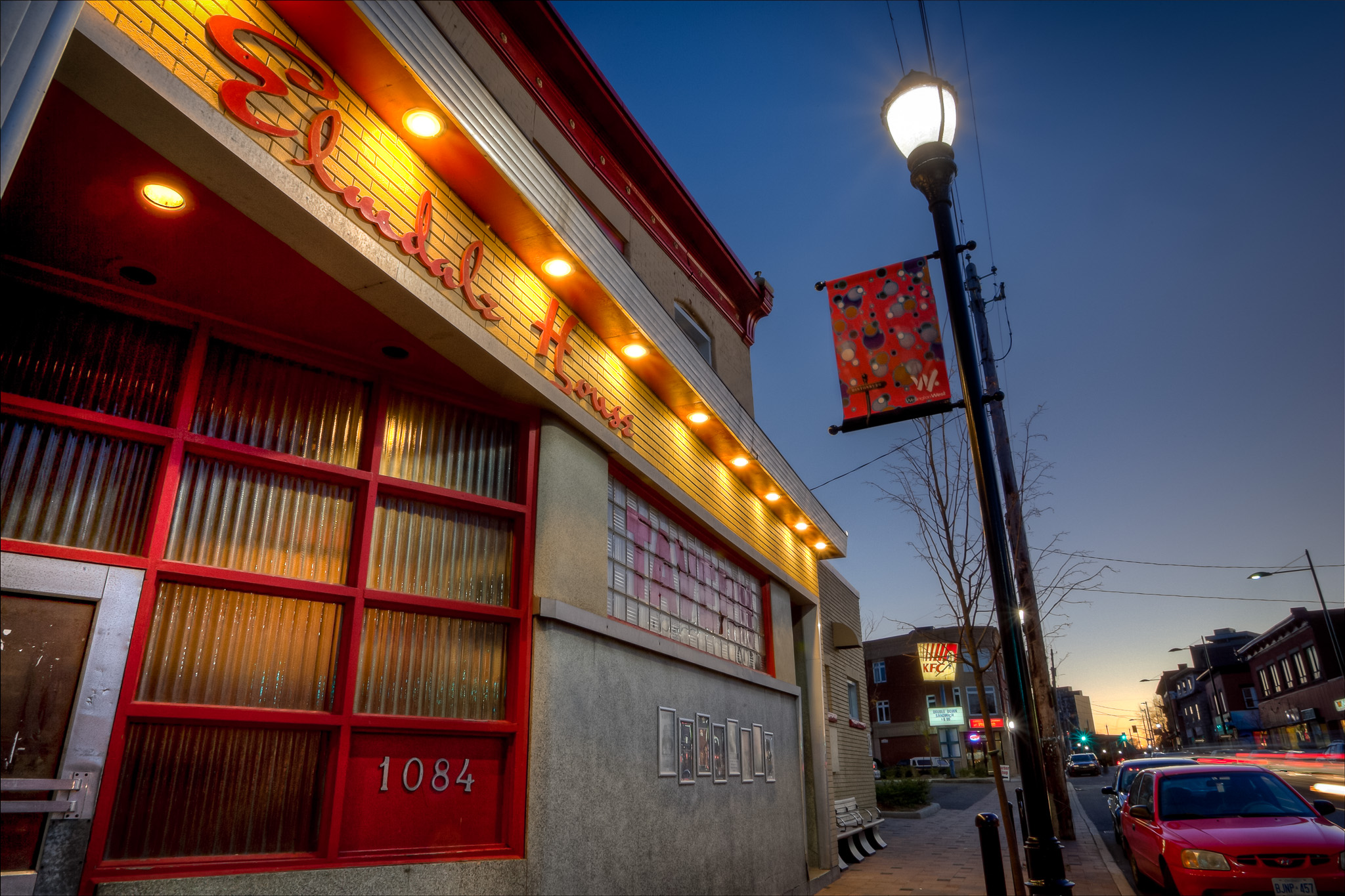
Ottawa Photographer Justin Van Leeuwen - Hintonburg's Elmdale House

It’s been a while since I posted a HDR image – mostly because I haven’t been shooting them. Some people hate the effect, some love the results. I find it’s usually pretty polarized within a few groups “photographers” and everyone else. See – photographers themselves are always polarized – which camera company, bag, lens, flash, modifier, windows or apple etc. etc. So entering a debate on how the final image is actually achieved is a sure-way to bring up debate.

Non photographers, largely, love it. They’re colourful, textured, surreal and sometimes painterly. These images can be re-interpreted by the artist a number of ways – so it’s not like all HDR’s are created equal.

Last night I went out with the intention of shooting some HDR images of my Hintonburg neighbourhood. I haven’t seen many of the hood, despite there being many “photogs” lurking around. Even moreso, there’s a huge group of “urbanites” lurking, waiting for some artistic interpretations of their neighbourhood. I hope to explore this in a series over the coming days, weeks and months.

If you’d like to see anything in particular, or want to come take some bracketed shots, or even want to diss the whole process – do so in the comments – thanks!

You can also see this bigger over on flickr.

Yin Yang

Yin Yang
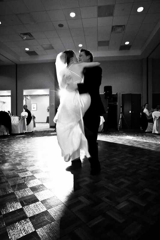
Maybe it’s not technical properties what make a compelling image.
I love this shot, it’s grainy, blown out in both directions. But that leap Erin is taking into Will’s arms – it sums up their whole experience for me – joyous and trusting, it’s what a marriage should be.

E&W Head Table

E&W Head Table
Here’s my photo of the head table – look at it, I know some things stand out to you, then think about them – I want to hear your thoughts.

See, I spent quite some time editing this image, or four images actually. It’s a composite of 3 groups, plus 1 for the background. The venue was so dark, that there was no way I’d get a “clean” image of the head table without adding lights. But instead of trying to blast it all at once, I photographed everyone in groups, with my light-stick silently moving along, illuminating my subjects.

The composite is super-obvious to me, but I spent an hour working on the image trying different ways – blending the background, trying to feather the white to purple balance. In the end I was able to isolate my favourite images of the wedding party, stick them all together, then slap them against the background. Photoshops new “Refine Edge” feature came in pretty handy here, as I think the masking job is pretty good.

All that said, I’ve spent too much time on the image, it’s all too obvious to me and I know exactly everything I’m looking at, every flaw. But that’s technical. What was your first impression? Do you like it? Did it seem “off” to you? Does the bride like it (I know you’re here!)? Leave a comment.

You can see a larger version of it on the flickr page.

JC

JC
It’s been a busy week. Back-to-back events have meant an overload of images on my computer; it’s a good thing I had recently revised my workflow in order to get through them that much faster.

I use Lightroom as my photo processing/cataloguing/kewording program of choice. I do about 90% of all my work there. I import images from a shoot and then quickly get to work culling them. That’s right – I delete images.

I have to say that my photography has gotten better as a result of this – it’s taught me to be a good editor, and as a good editor I take fewer shots in the first place. Of course I’m not as judicious with the “X” key as some, but I do it in a way that anything, say, unflattering of a bride, completely useless in general, or one of several accidental shots of my feet, gets deleted. I’ll keep doubles, even tripples of very similar images if they’re all good “just in case” and then quickly move to rating the images.

I work with Lightroom’s star system to sort out the “best” of any set of images. Usually the best one of any burst of images. At an event I’m taking 3-5 shots of any group and, really, if I didn’t move they’re all the same save for someone different blinking every time. If needed, I’ll take two images and blend them in Photoshop so everyone has a great smile, and eyes open as they intended.

Those are what I show to the client. Not the full set, not the stupid-face, but the best of what I have. It gives them a preferred sampling and, if they ask for “something different” I’ll gladly show them the ones I chose to leave behind. They usually go back to my selects 😉

Do you have a unique workflow? Using other programs like Photo-Mechanic or Aperture? This is just a taste of what works for me but I’d love to hear what other folk do.

White Wedding

White Wedding
Erin & Will – congratulations on gettin’ murried.

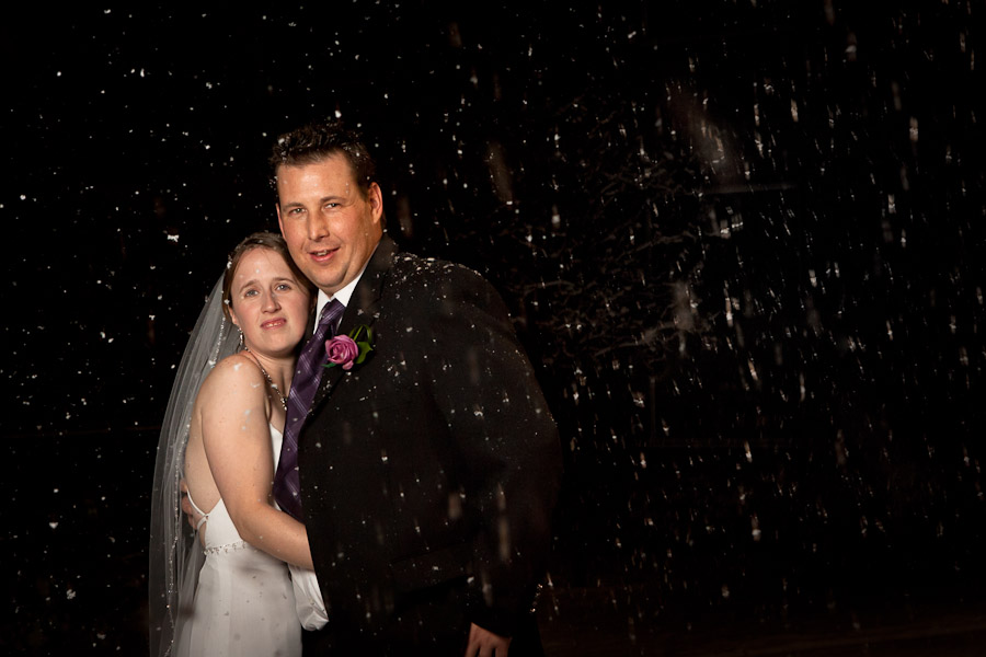
I had the absolute pleasure of photographing Erin & Will’s wedding this weekend. Despite all location scouting going to shit (it rained… then snowed!) I had planned some indoor contingencies and packed some big lights to take good portraits. This one, though, was a bit simpler.

I couldn’t resist capturing the snow-storm that sprung up during the reception (hey, it’s Ottawa!), so my 2nd shooter Younes and I tested a few exposures near the exit. This wasn’t going to be the best lit shot of all time, just one to capture the day (I wasn’t going to make anyone stand outside while I tweaked a separation light into that black hole of a night).

Was it cold? Yes! But Erin comes from tough stock and went outside no-problem. Popped off a few shots and this was the one that had the least snow blocking their faces 😉 I’ll likely show a few more as I sort through the deluge of great photos from this wedding, but the question remains: “If I book Justin Van Leeuwen for a wedding, will he make me stand in the cold on my special day?” Maybe.