I have some editorial portrait photography stuff in the works, but while I wait on that to go to print I have another review out on Canonrumors.com. This one’s for the flashes, and if you know me, you know I *love* to flash people… ahem.

I have some editorial portrait photography stuff in the works, but while I wait on that to go to print I have another review out on Canonrumors.com. This one’s for the flashes, and if you know me, you know I *love* to flash people… ahem.
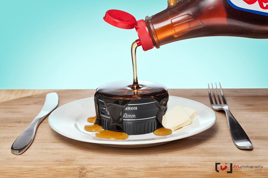
A product photo for my review of the Canon 40mm ƒ/2.8 “Pancake” lens for Canonrumors.com.
It was a fun thing to do, honestly, 90% of my product photography is against a white backdrop. It makes sense, most websites have white backgrounds, white sits well as an image into them highlighting the product but it just gets boring after a while, and it’s a reason I don’t show too much of it here on the blog. It just made sense, you know? A pancake lens… set as a pancake? Funny right? Most people seem to like the image too, though the number one critique is that I didn’t place the knife and fork right. A casual oversight that I never even considered because I don’t set my breakfast table with any level of formality. Have you ever tried to feed three hungry boys pancakes and bacon? You can basically serve it right into their face.
I documented the steps, just for the folks who are interested in the kind of work that goes into this kind of photography. You can read about how I shot it, including all the post processing, over at Petapixel.com. You can also check out a larger version of this image on Flickr, thanks!
I don’t often show the events I photograph. Most often, the event photography consists of some important people grip-and-grinning and, near the end, tend to be drunken revellers at a private function, so there’s really not much to see, or not much anyone’s willing to show.
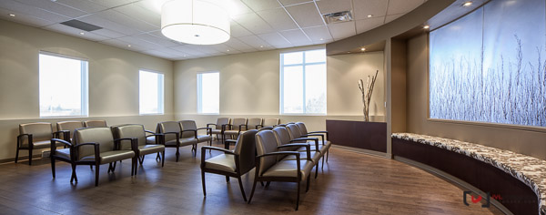
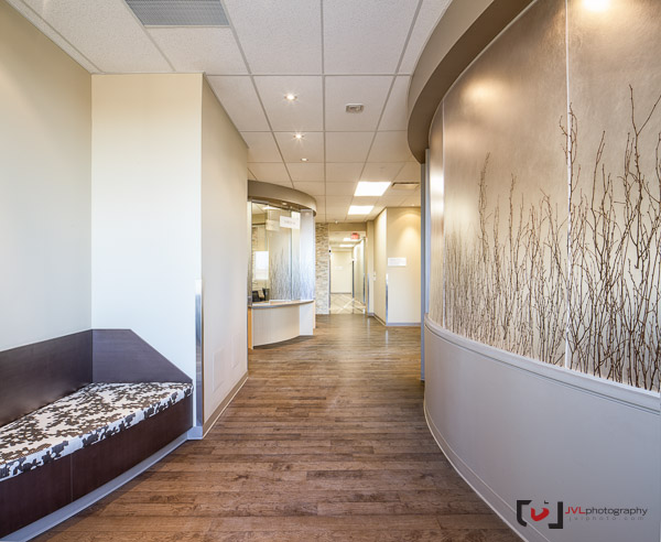
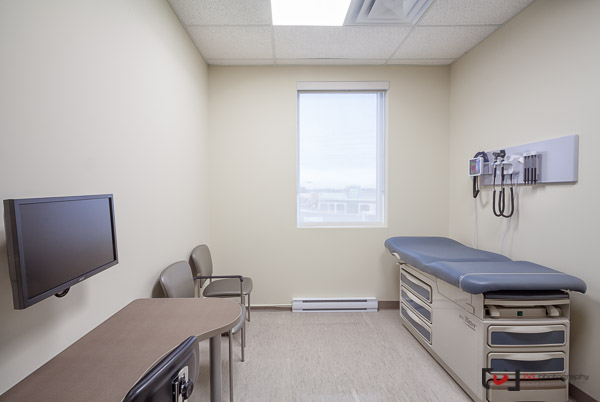
Another great interior project I photographed for my clients Turnbull Design Consultants Ltd.. It’s a new medical clinic above a Shoppers Drug Mart out in Manotick. I definitely appreciate a clinic that invests a bit in its design. How you enter something so… “clinical” certainly affects how you will experience it. It’s user interface in the real world, the original UI. Our environment affects our mood, and how we can possibly react to things. Being more comfortable in an space that can make some people apprehensive (not to mention just the amount of time you spend waiting) is sure to make it a more positive experience.
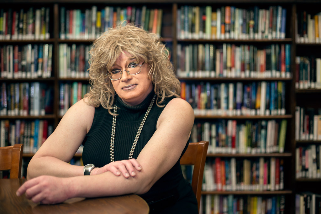
A few portraits today. Typically, the new year starts of pretty slow for me, my clients rub off their hungover weary holiday eyes, realize they’ve spent all their money on egg-nog and iPads and need to hold off a bit until February to start booking me again. Thankfully, the Kitchissippi Times wanted the first issue of the new year to have some great cover options so they called me in to cover two potential candidates.
The shoot was for the “Human Library Project” which takes a number of individuals, from varied backgrounds and experiences and lets people come in and “book” them for 20 minutes. Not a bad idea, if you want to know what a CBC reporter goes through during his day, or if you’re interested in one of Ottawa’s most outspoken drag-queen’s… some really interesting stuff to glean off them I’d think.
We only had about 10 minutes with Giacomo Panico, reporter for CBC Radio, first thing in the morning, it was about -26C… I really wouldn’t have wanted more than 10 minutes anyway since, after a bit of setup, my hands were pretty-much frozen. We also didn’t have access to the library that early, which meant limited contextual background options. That’s the Ottawa Public Library sign behind him there, but that’s about it. You can see his eyelashes frosting up from his bike-ride that morning.
Zelda had an evening availability, so we were able to invade my small local library as a backdrop. I originally tried some shots in the stacks, but with books jetting out and the only option of booming a softbox over the bookshelves it just didn’t have the “look” I had envisioned. While my editor sat with Zelda, though, I framed her up with a simple wall of books behind. Library + Zelda = human book project. Simple enough yah? You can check out this edition of the KT here.